Kraliçe Version 8.0:
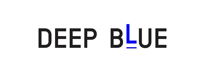
DEEP BLUE
Salt Beyoğlu
October 31, 2014 19.00

When Deep Blue, the monumental computing machine, won the mythical chess game over Garry Kasparov in 1997, the “thinking machine” was born in the popular imagination. Taking inspiration from this advancement in artificial intelligence, DEEP BLUE, the eighth typeface commissioned for SALT will present the alphabet as a tool to open new corridors of research and exploration. When found online, the four letters S-A-L-T will be positioned as a series of hyperlinks, curated toward material that provides additional layers and further content related to SALT’s programs.
DEEP BLUE designed by Åbäke will become Version 8.0 within the commissioned program for SALT’s identity program Kraliçe. It is launched on November 1 to coincide with the 2nd Istanbul Design Biennial in which Åbäke also participate. DEEP BLUE will take over from the typeface currently in use: Version 7.0: Kraliçe Color, by Sueh Li Tan.
About Kraliçe
Kraliçe is a typographic system by Project Projects that explores the transformation of immaterial goods through networks. Originally created as the identity program for SALT, Kraliçe is an open system that allows for accrued meaning over time. The institutional mark is distributed throughout the typeface as the four letters S-A-L-T. New designers are invited to reinterpret these four embedded characters on an ongoing basis, thereby reframing both the typeface and institution’s identity.
A conversation on Kraliçe
Åbäke, Prem Krishnamurthy (Project Projects) and Vasıf Kortun (SALT)
October 31, 19.00
SALT Beyoğlu, Walk-in Cinema
Åbäke, Prem Krishnamurthy (Project Projects) and Vasıf Kortun (SALT)
October 31, 19.00
SALT Beyoğlu, Walk-in Cinema

